A UX Roadmap for Effective Dashboard Design
This post is part one in a two-part blog series written by Ryan MacCarrigan, founding principal at LeanStudio.
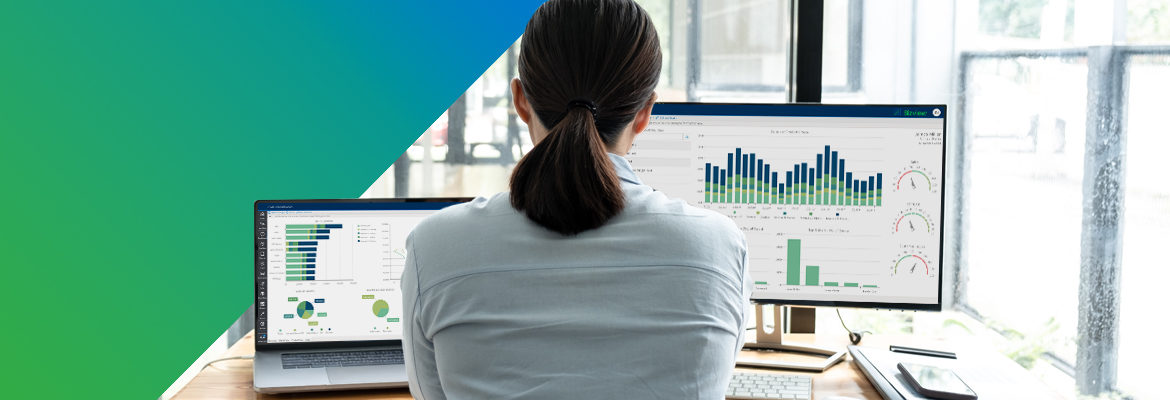
Dashboards present one of the most complex product design and UX challenges—which is why so many software teams choose to work with third-party vendors instead of building their own dashboards from scratch.
The first and most important step in the development of any dashboard is deciding which users you’re designing it for and prioritizing the needs and desired outcomes the dashboard will address. Unfortunately, the visual look and feel of the dashboard is where many teams prefer to begin the design process. Who doesn’t love a beautiful dashboard with all the bells and whistles? But there is nothing beautiful about a visually arresting design that doesn’t effectively help users achieve their goals.
So how does one successfully design a dashboard that enhances the user experience? Let’s take a deep dive into dashboard UX to see what practices, tips, and principles you should know about designing a good dashboard.
Design for Adoption: Expert Dashboard UX Tips
Download NowBasic Dashboard UX Considerations
When designing a dashboard, it’s important to remember that the design should not increase the cognitive load of the user to such a degree that they avoid engaging with the content they see in front of them. As defined by the Nielsen Norman Group, cognitive load refers to the sense of intimidation that a user often feels when presented with large amounts of data all at once. For example, we tend to avoid large, dense blocks of paragraph text because it seems like there is too much content to sift through.
Older Print Version: Classifieds Page

Minimizing cognitive load comes with avoiding visual clutter. The information within a good dashboard should be presented in a simple way that can be read and understood at a glance. Whether the dashboard is surfacing performance data, financial data, or product usage data, it should show the most important information first as it pertains to the current user.
The use of widgets in dashboards has long been a common design pattern. But they can quickly get out of control. Widgets should reduce visual clutter, not contribute to it. They should be able to scale or be rearranged into different layouts that can be saved into custom views depending on the needs of each user segment. Good dashboard UX is all about striking the right balance between showing too much and too little without sacrificing usability.
Bad Dashboard Example: Amazon Seller Central
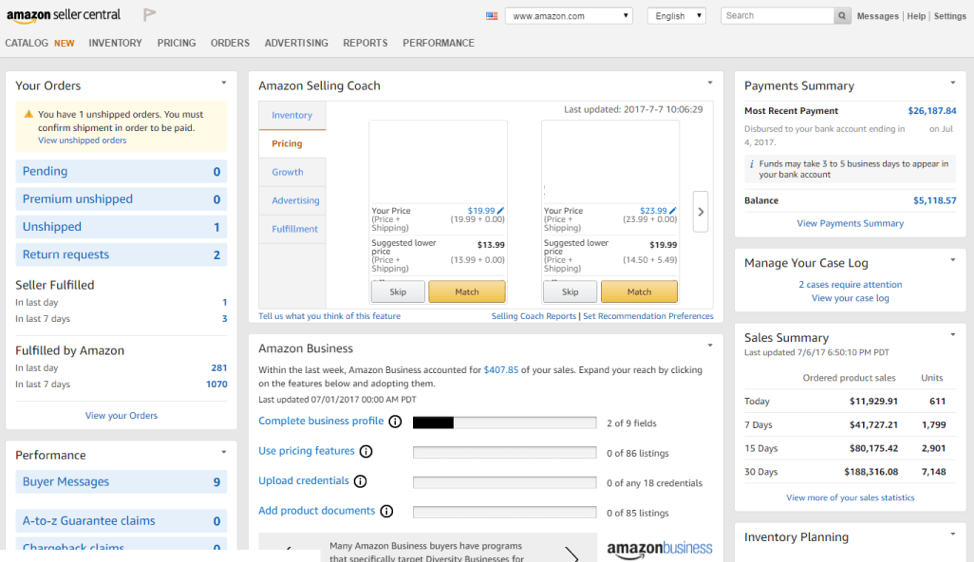
What’s going on here? Your guess is as good as ours.
Good Dashboard Example: FusionCharts Smart Energy Monitoring Dashboard
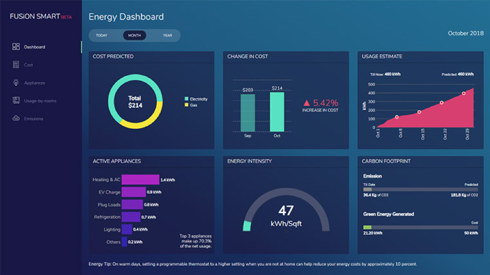
Clear titles and descriptions paired with easy to understand data visualizations mean that this dashboard is highly usable, and its insights highly actionable, at a glance.
When designing a dashboard, it’s also important to consider the number of users who will depend on it. Often, there are only one or two users directly interacting with the platform but there may be other stakeholders who rely on insights from the product to make informed decisions. Though we are designing for the immediate end user, we must also take these “hidden” stakeholders into account when deciding which user needs to surface in our designs. For example, users may need to run reports which they export and share with these decision makers. The ability to run, export, and share reports should therefore be prioritized as a feature.
Written with editorial assistance from Sarah Han, Medill School of Journalism, Northwestern University.

UX Design for Embedded Analytics
Download Now: