Effective Color Schemes for Analytics Dashboards

This post was written by Midori Nediger, Information Designer at Venngage, an online infographics tool.
Color choice is paramount when it comes to designing effective dashboards and reports for applications. Used properly, color can enhance, clarify, and add insight to a visualization. Misused, color can hamper understanding, often distracting from and obscuring the data.
Aside from any aesthetic considerations, dashboard color schemes should tell users something about the data that the dashboard aims to communicate. Here, I’ll outline how application teams can use dashboard colors to convey three messages:
- Encode quantity
- Indicate groupings (to label data)
- Create contrast (to focus attention on key information)
Encode quantity with sequential or diverging color schemes
Color can be used to encode quantity with either sequential or diverging color schemes. The concept is simple: Your color scheme represents a visual scale that maps to a numerical scale to represent quantity.
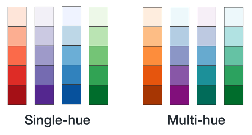
When representing quantitative data with color, it’s imperative that values are mapped to colors in a way that the data is represented faithfully and each color is readily distinguishable from the others.
To make this happen, color schemes cannot simply consist of different shades of the same hue. Instead, each shade should vary slightly in hue, saturation, and lightness. Color schemes created this way are called multi-hue schemes.
Source: http://www.venngage.com/
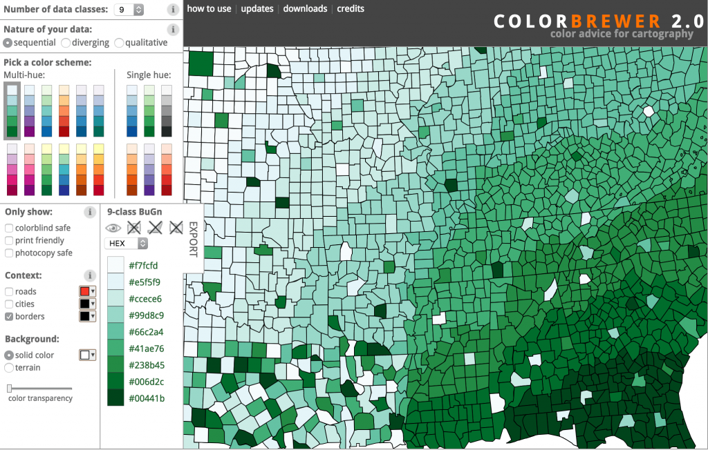
An invaluable resource for multi-hue color palettes is ColorBrewer2. Originally made for cartography, it’s become an industry standard for data visualization novices and experts alike. It allows you to choose between sequential and diverging schemes, and gives you the option to set the number of data classes (or “steps”) in the color scheme.
Source: http://colorbrewer2.org/
If you’re looking to build custom multi-hue schemes, check out Color Picker for Data. You pick the desired start and end values for your color scale, and the tool generates perceptually equal steps between those colors. It even allows you to preview the generated palette on a map with a sample dataset.
Indicate groupings with categorical color schemes
If you’re not using dashboard colors to encode value, you can use them to indicate groupings—to tell users which data elements belong to which categories.
The goal here is to find colors that are “optimally distinct”—colors that are easy to distinguish from one another that have approximately the same lightness and chroma level.
Anyone who has ever tried to build this kind of color palette from scratch will tell you that it’s near impossible. It’s a challenge to come up with a palette of five to six readily distinguishable colors that doesn’t look garish.
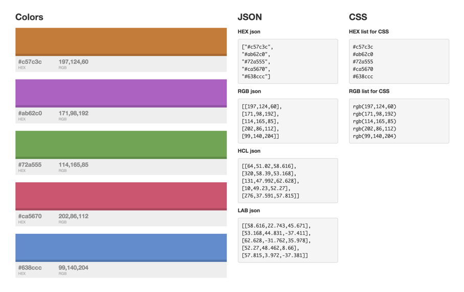
Luckily for us, some brilliant visualization designers have built tools that create such palettes for us. The most flexible is a tool called I Want Hue, which allows you to designate the number of colors you need and spits out the resulting palette in JSON, JavaScript, and CSS.
Source: http://tools.medialab.sciences-po.fr/iwanthue/index.php
Highlight key information by contrasting bright, saturated hues with light greys
Besides using color to encode properties of our data, we can use color to highlight key data points to help end users understand the data. Reserve the brightest, most saturated colors for only the most important information, and use less saturated colors for less important information.
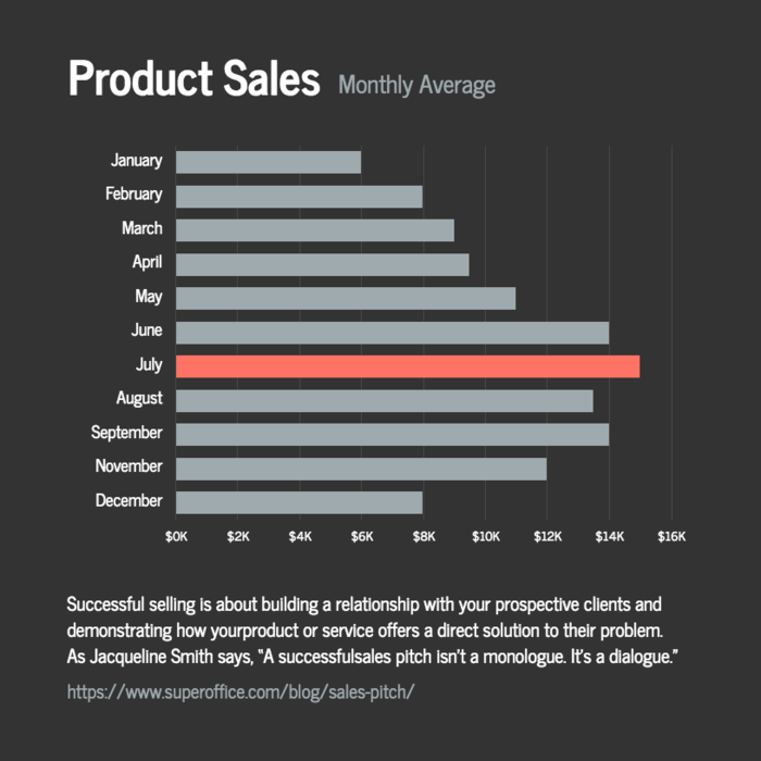
Source: https://venngage.com/templates/charts
Even better, you can apply subtle greys to any supporting data to push that information into the background, allowing the key points to command users’ attention. This is the single simplest way to reduce visual clutter in particularly complex dashboards.
Final thoughts
We all recognize the aesthetic role of color in data visualizations, but its power as a communication tool should not be overlooked. Leverage these techniques to design dashboards that are as meaningful as they are beautiful.