The Dos and Don’ts of Dashboard Design

Dashboard design is always evolving. To make your dashboards as effective and accessible as possible, you need to stay on top of trends that are resonating with users—what worked two years ago might not work today.
When designing your dashboards, there are some current “Dos and Don’ts” that you should keep in mind. Ultimately, a user should be able to see and understand the data at a glance, and by overloading your dashboard with a clunky layout or bad color schemes, you’ll end up obscuring rather than highlighting the data.
3 Dashboard Design Trends to Start or Continue (aka the Dos)
Asymmetrical Design. Asymmetrical design is a popular design approach in which heavier elements on a page stand out a bit more and lighter elements recede into the background or foreground. Using asymmetrical design allows you to focus your users’ eyes on the most important elements of your dashboard or product—a huge benefit when users are in a hurry.
Use of Color. Intelligent use of color is a great way to define your brand or define the styling of your dashboard. Remember, though, that less is more, so try not to go too far with excessive color palettes or bright and vibrant colors. Intelligent use of colors will also help you with 508 compliance, ensuring that colorblind and visually impaired users can use your products as well.

Using Icons as Visual Cues. Visual cues allow end users to follow a trail through your dashboard. Using icons can help your users understand their data, and engage the importance of specific data sets and data values. This helps overall readability and allows you to more easily guide your readers through a dataset.
![]()
3 Design Trends to Avoid (aka the Don’ts)
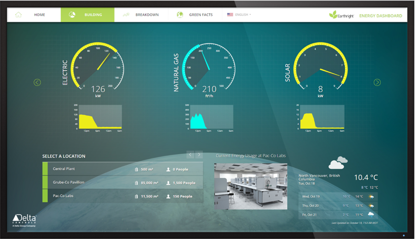
Gradients. Gradients are great for accentuating specific pieces on a webpage or dashboard, but don’t work nearly as well as the primary colors. Your designers should also try to avoid using gradients as the color sets for important information such as bar charts, line graphs and KPIs.

Analog gauges. Current design trends are moving towards using more material and flat gauges rather than analog gauges.

3D visuals. 3D visuals are no longer in style, and can really date your website or product. To stay current, we recommend using more current design trends, like material and flat designs.

Key Takeaways
- Utilizing best design practices is extremely important when creating analytics dashboards.
- Modern design trends include asymmetrical design, color, and using icons as visual cues.
- Avoid gradients, analog gauges, and 3D visuals in graphs.

The Definitive Guide to Dashboard Design
Download Now: