The Usability of Dashboards (Part 1): Does Anyone Actually Use These Things?
This post was written by Tristan Kromer, Innovation Coach & Founder at Kromatic, and Anteo Quiroz, Innovation Coach and Head of Sales at Kromatic.
Dashboards showing ever-increasing levels of information are more and more in demand, but perhaps less and less understood. In particular, application teams selling products are pushed by their customers to include “high-level overviews” and “real-time information” in their software. But do they use that information? How often? And what for?
Sometimes a dashboard is a critical piece of software enabling near-instantaneous responses to extinction-level business catastrophes.
But sometimes, it’s just a means for our customers to feel like they’re in control. Without a clear understanding of the purpose behind the information, a dashboard can wind up feeling like an over-engineered vanity piece for users to feel good about and then ignore.
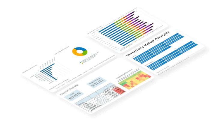
17 Dashboard Design Tips for Non-Designers
Access ResourceSo when designing a dashboard, the first thing to do is figure out what it’s good for.
What’s a dashboard good for?
Dashboards have a few common uses:
- Warnings
- When your oil pressure gauge indicates a dangerous situation, you’d better pull over and take action. If you don’t, your car will pull over on your behalf.
- Analytics
- Automobile dashboards are not designed for the driver to double click on the “check engine” light while in motion, which would be dangerously distracting. Much in the same way, the level of drill-down information in Google Analytics can be very distracting, severely reducing productivity.
- Nevertheless, today’s business dashboards can (but not necessarily should) provide a level of analysis by incorporating pivot tables, GANTT charts, and more. Once a warning is triggered, users can conduct further analysis to either decide on a course of action or dismiss the red alert altogether.
- PR / Morale
- I admit it—I’ve kept track of a few vanity metrics over the years. Sometimes you need to show something like “total value of potential sales in our CRM,” even though there’s no action to take and you pretty much always want it to be higher.
- Sometimes it helps to easily collect numbers for an annual stockholder meeting (or all-hands staff meeting) that make everything look good, and there’s no shame in that. Morale is important.
- Situational Awareness
- Agilists like to use the term Information Radiator to describe any artifact that one simply cannot help but absorb data from just by being in the same room. When Captain Picard calls for red alert, the information radiators spring into action, and it is impossible for anyone on the Enterprise to not know that the red lights and sirens mean they’d better get to battle stations.
- Some dashboards are designed to keep organizations aligned by maintaining a constant level of awareness around certain KPIs so no one can claim ignorance. This includes that “This facility has gone 5,843 days without an assimilation” sign. As Locutus of Borg might say, resisting this information is futile.
Your dashboard may serve more than one of these needs, but it should fill at least one! If you don’t know the job your dashboard is meant to get done, you probably won’t be able to build it, and you definitely won’t be able to test if it’s doing that job well. A frequent question I hear is “What metrics should we be measuring?”
To figure out the job-to-be-done, you need to do customer discovery interviews, a.k.a. talking to humans. Here are a few questions to get started:
Example Customer Discovery Guide
- Why do you want this information here?
- Is this information meant to “stop” an action or trigger an action?
- Describe the last time the information seemed “off”? Walk me through the steps you took to validate or invalidate this assumption.
- What have you changed in your process to make sure that doesn’t happen again?
- Who else uses this information? What for?
- Have you created any workarounds to find the information you want?
With great-looking dashboards and reports, product managers can create stickier, more valuable applications. Follow this checklist for dashboard design.
The Definitive Guide to Dashboard Design
Download Now: