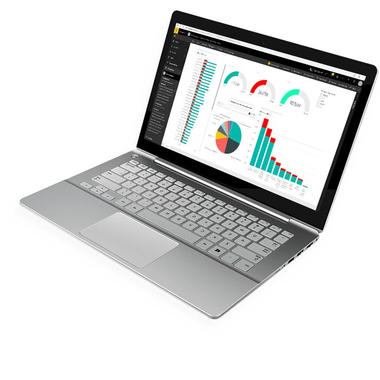
Fast, Flexible Business Dashboard Software From Anywhere
You Want Easy Access to Answers When and Where You Need Them
You Lack the Technical Skill to Write Your Reports
It’s hard to make informed decisions and drive effective change when you have to rely on a technical specialist to create and edit reports and dashboards.
You Don’t Have Full Visibility of Your Data
Most ERP solutions were built to collect data, not to report on it. Accessing data from thousands of tables and formatting it in a consumable way is not an easy task.
Everyone on Your Team Needs to See the Same Information
Without an easy way to share reports and collaborate between departments, your organization is not making the data-driven decisions they need.
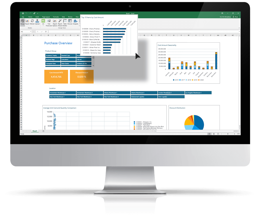
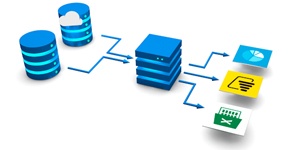
Create Dashboards Directly Inside Excel
Analyze metrics without having to know the underlying data structure in your ERP system. Drag and drop the data you want to analyze and create sophisticated business intelligence dashboards directly in Excel with minimal effort.
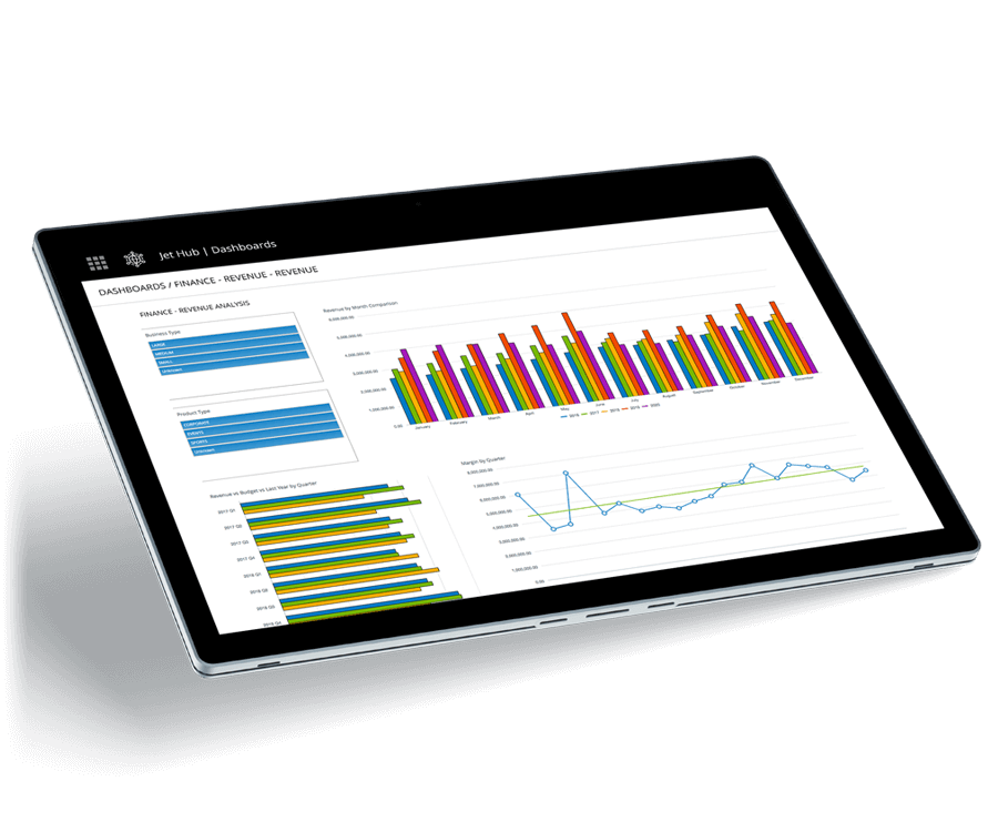
Empower Users to Make Decisions from Anywhere
With access anywhere, you can view data inside of Excel, on the web, through mobile devices, in Power BI, and more. Instantly group and filter data to identify the causes and spot key trends from virtually any device with a web browser.
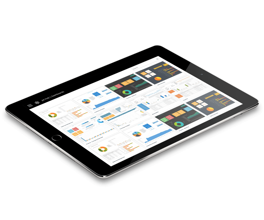
Data Visualization Your Way
With accurate, governed data, you can publish and share dashboards with confidence. Schedule updates at regular intervals to ensure your team is always looking at the right information and the same version of the truth to make vital business decisions.
Integrates with:

- Oracle E-Business Suite (EBS)
- Oracle EPM Cloud
- Oracle ERP Cloud
- Oracle Essbase
- Oracle Financial Consolidation and Close (FCCS)
- Oracle Fusion
- Oracle Hyperion Enterprise
- Oracle Hyperion Financial Management (HFM)
- Oracle Hyperion Planning
- Oracle PeopleSoft
- Oracle Planning and Budgeting Cloud Service (PBCS)
- Oracle Tax Reporting

- Dynamics 365 Business Central
- Dynamics 365 Finance and Supply Chain Management
- Dynamics AX
- Dynamics CRM
- Dynamics GP
- Dynamics NAV
- Dynamics NAV C5
- Dynamics SL
- SQL Server Analysis Services (SSAS)


- Deltek Ajera
- Deltek Maconomy
- Deltek VantagePoint
- Deltek Vision
- Deltek Vision Cloud

- Viewpoint Spectrum
- Viewpoint Vista

- MRI Commercial Management
- MRI Financials
- MRI Horizon
- MRI Horizon CRE
- MRI Qube Horizon
- MRI Residential Management
- Epicor Avante
- Epicor BisTrack
- Epicor CMS
- Epicor Enterprise
- Epicor Epicor SLS
- Epicor iScala
- Epicor Kinetic
- Epicor LumberTrack
- Epicor Manage 2000
- Epicor Prophet 21
- Epicor Tropos

- Infor CloudSuite Financials
- Infor Distribution SX.e
- Infor Financials & Supply Management
- Infor Lawson
- Infor M3
- Infor System21
- Infor SyteLine
- Sage 100
- Sage 100 Contractor
- Sage 200
- Sage 300
- Sage 300 CRE (Timberline)
- Sage 500
- Sage 50cloud Accounting
- Sage AccPac
- Sage Adonix Tolas
- Sage Estimating
- Sage Intacct
- Sage MAS
- Sage X3
- 24SevenOffice
- A+
- AARO
- AccountEdge
- Accounting CS
- Accountmate
- Acumatica
- Alere
- Anaplan
- Aptean
- Assist
- ASW
- Aurora (Sys21)
- Axion
- Axis
- BAAN
- Banner
- Blackbaud
- BlueLink
- Book Works
- BPCS
- Cayenta
- CCH
- CDK Global
- CedAr e-financials
- CGI Advantage
- Clarus
- CMiC
- CMS (Solarsoft)
- Coda
- Coins
- Colleague
- CPSI
- CSC CorpTax
- Custom
- CYMA
- DAC
- Data Warehouse
- Datatel
- DATEV
- Davisware Global Edge
- Davisware S2K
- Deacom
- DPN
- e5
- eCMS
- Eden (Tyler Tech)
- Emphasys
- Entrata
- Etail
- Expandable
- FAMIS
- Famous Software
- Fern
- FinancialForce
- FireStream
- FIS
- FiServ
- Flexi
- Fortnox
- Foundation
- Fourth Shift
- Friedman
- Full Circle
- GEMS
- Harris Data (AS/400)
- HCS
- HMS
- IBM Cognos TM1
- IBS
- IBS-DW
- In-House Developed
- Incode
- INFINIUM
- IQMS
- iSuite
- Jack Henry
- Jenzabar
- JobBOSS
- Jonas Construction
- M1
- Macola
- MACPAC
- Made2Manage
- MAM
- MAM Autopart
- Manman
- Mapics
- McLeod
- MEDITECH
- MFG Pro
- MicrosOpera
- MIP
- Mitchell Humphrey
- Movex
- MRI
- MSGovern
- Munis (Tyler Tech)
- New World Systems
- Onesite
- Onestream XF
- Open Systems
- PDI
- Penta
- Plexxis
- PowerOffice
- PRMS
- Pro Contractor
- ProLaw
- Q360
- QAD
- Quantum
- Qube Horizon
- QuickBooks Desktop Premier
- QuickBooks Desktop Pro
- Quickbooks Enterprise
- QuickBooks Online
- Quorum
- RealPage
- REST API
- Retalix
- Ross
- SmartStream
- Spokane
- Springbrook
- Standalone DB with ODBC/DSN connection
- Standalone IBM DB
- Standalone Oracle DB
- Standalone SQL DB
- SUN
- Sunguard
- SunSystems
- Sys21
- SyteLine
- TAM (Applied Systems)
- Thomson Reuters Tax
- Timberline
- TIMELINE
- Traverse
- TripleTex
- Unit4
- Unit4 Agresso
- Unit4 Business World
- Unit4 Coda
- USL Financials
- Vadim
- VAI-System 2000
- Vantage
- Vertex
- Visma
- Winshuttle
- Wolters Kluwer CCH Tagetik
- WorkDay
- Xero
- xLedger
- Xperia
- Yardi
- Yardi-SaaS
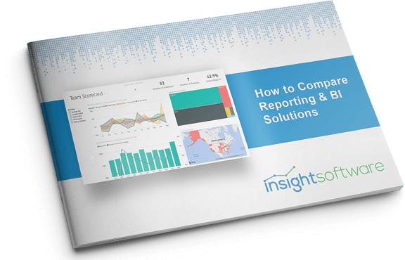
How to Compare Reporting & BI Solutions
Reporting and Business Intelligence (BI) solutions begin and end with data—not just how the data are collected, but also how they are stored, organized, and accessed. With a saturated market full of solutions to choose from, you need to have a clear understanding of your data needs before you start comparing your options.
In this white paper, you will learn:
- What to look for in reporting and/or BI software.
- Why a reporting and BI solution is essential for growth
- How to avoid reporting and BI solution implementation failure
To assist with your software selection process and help you find a solution that fits your current ERP system and IT infrastructure, we have also created a framework for evaluating third party solutions.
You need to have a clear understanding of your data needs before you start comparing your options.
Work with the #1 Reporting and Business Intelligence Vendor for ERPs and EPMs
“Through Jet Analytics, we are able to produce monthly dashboards that we couldn’t before. Our operations team now gets this information quickly, giving them the ability to make informed decisions that impact the business.”
Speak to an Expert