insight Encyclopedia
Sparkline Charts
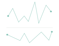 Sparkline charts are data visualizations best used for showing many trends at once, as assets of small timelines. They are great for showing variation in some measurement in a simple and condensed way. A prime example of a sparkline chart is the market summary of the U.S. DOW Jones and S&P 500 stocks.
Sparkline charts are one of many types of data visualizations used to organize and present data in a way the audience can understand and take action on. To ensure visualizations have real business value, it’s important to know which types of visualizations are best suited for a given data set.